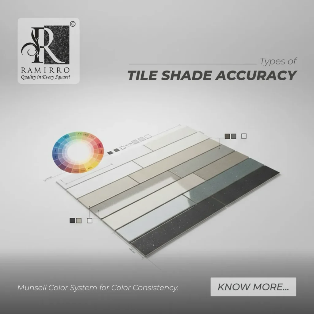
Types of Tile Shade Accuracy: Munsell Color System for Color Consistency
Tiles that appear identical in a showroom can look surprisingly different once installed in a home, office, or outdoor space. This happens because tile color is influenced by lighting, surface finish, production batches, and even kiln temperature during manufacturing. Understanding types of tile shade accuracy is essential to achieving consistent, uniform surfaces and this is where the Munsell Color System plays a vital role. By defining color through measurable dimensions, it helps manufacturers and designers control shade variation and maintain color consistency across tiles. At Ramirro Ceramica, this science driven approach to color is part of how tile collections are developed with greater precision, ensuring that what customers select is closer to what they see in the final installation.
- Types of Tile Shade Accuracy: Munsell Color System for Color Consistency
- Why Two “Same” Tiles Don’t Always Look the Same
- What Does “Tile Shade Accuracy” Really Mean?
- Types of Tile Shade Variation
- Who Was Albert Munsell and How Did He Change Color Science?
- In Which Countries Is the Munsell Color System Used?
- The Munsell Color System: The Backbone of Tile Shade Control
- Types of Shade Differences the Munsell System Helps Identify
- Why Tiles Need More Than Just One Color System
- How Tile Factories Actually Control Color
- Why Lighting Changes Tile Color (And How Systems Help)
- How Ramirro Ceramica Uses Color Science for Consistency
- What This Means for Homeowners & Designers
- At Ramirro Ceramica, Tile Colour Isn’t Guesswork — It’s Science Driven Precision
Why Two “Same” Tiles Don’t Always Look the Same
Have you ever selected a tile in a showroom, only to notice it looks slightly different after installation? You’re not imagining it. A tile can appear lighter, darker, warmer, or cooler depending on where it is placed. Under bright showroom lights it may look one way, inside a home with softer lighting it may look another, and in outdoor sunlight it can change again.
Even tiles from the same design and brand can have small shade differences between production batches. These variations can happen because of natural changes in raw materials, glaze mixtures, or temperature inside the kiln during firing. The surface finish also matters; matte, glossy, or textured tiles reflect light differently, which changes how our eyes see the color.
This shows that tile color is not just about design or decoration, it is controlled by science. To manage these differences and maintain color consistency, the tile industry relies on structured color standards known as global color systems, such as the Munsell Color System, which help measure, classify, and control tile shades more accurately.
What Does “Tile Shade Accuracy” Really Mean?
Tile shade accuracy simply means that the color you choose is the color you actually receive. When tiles are installed, they should look uniform across the entire space, without patches that appear lighter, darker, or slightly different in tone. It also means that if you need extra tiles later for repairs or extensions the new tiles should match the earlier ones as closely as possible.
However, achieving perfect shade consistency is not always easy. Tile color can vary for several reasons, and understanding these differences helps explain why color control systems are so important in manufacturing.
Types of Tile Shade Variation
Batch Variation – Tiles produced on different days or in separate production runs may show slight shade differences due to changes in raw materials or firing conditions.
Lighting Variation – The same tile can look different under cool white lights, warm indoor lighting, or natural sunlight.
Surface Variation – Matte, glossy, or textured finishes reflect light differently, which changes how the color appears to the eye.
Digital vs Real Variation – Colors seen on websites or catalogs may not perfectly match the physical tile due to screen settings and digital display limitations.
Glaze Reaction Variation – During firing, high kiln temperatures can slightly alter glaze chemistry, causing small shifts in the final shade.
Who Was Albert Munsell and How Did He Change Color Science?
Albert Henry Munsell (1858–1918) was an American painter and art teacher who struggled to explain color differences clearly to his students. At the time, colors were described with vague words like “dark red” or “light brown,” which caused confusion in art, design, and manufacturing.
To solve this, he created a structured color system that describes color using three measurable parts:
Hue – the color family (beige, grey, red)
Value – how light or dark the color is
Chroma – how strong or intense the color appears
This three part model became the foundation of modern color science. Today, tile manufacturers use the same principles to control shade variation and maintain color consistency, helping prevent visible differences after installation.
In Which Countries Is the Munsell Color System Used?
United States – The system originated here and is widely used in education, agriculture (soil color charts), manufacturing, and design research.
Japan – Strongly used in industrial color studies, ceramics, coatings, and design education, with long standing contributions to color science.
European countries (such as Germany, Italy, and the UK) Referenced in design education, material research, and industrial color communication, and influential in the development of modern color measurement systems.
India – Used in soil science, academic color education, and some industrial and ceramic research environments.
Other countries including Australia, Canada, South Korea, and China also reference the system in universities, research labs, and industries where accurate visual color identification is important.
The Munsell Color System: The Backbone of Tile Shade Control
The Munsell Color System explains color in a simple and structured way, which makes it very useful in tile manufacturing. Instead of describing colors with vague words, it breaks color into three clear parts:
| Term | Simple Meaning | Tile Example |
|---|---|---|
| Hue | The basic color family | Beige vs grey |
| Value | How light or dark the color is | Light beige vs dark beige |
| Chroma | How strong or intense the color looks | Soft neutral beige vs more yellowish beige |
This is important because two tiles can both be called “beige” and still look different. They may share the same hue, but:
One tile might be slightly darker (value difference)
Another might look more yellow or stronger in tone (chroma difference)
These small differences may not be obvious in a single tile but can become noticeable after installation across a large area. The Munsell system helps manufacturers identify and compare these variations before tiles reach the site, supporting better shade control and color consistency.
The system is used internationally in color education, research, and industries where visual color accuracy matters.
Types of Shade Differences the Munsell System Helps Identify
Value Variation (Light Dark Shift)
This happens when one batch of tiles looks slightly lighter or darker than another. It is one of the most common issues in floor tiles and can make surfaces appear patchy.
Chroma Variation (Color Strength Change)
Chroma refers to how strong or muted a color looks. In neutral, pastel, or stone look tiles, even a small increase in color intensity can make tiles appear warmer or more saturated than intended.
Hue Drift (Color Family Shift)
Hue drift occurs when the basic color family changes slightly. For example, a beige tile may start to look more pinkish or yellowish across different batches.
Perceptual Variation Under Light
Tiles can look different under showroom lights, home lighting, or natural sunlight. The Munsell system helps evaluate tiles under standard lighting conditions so visual differences are reduced in real installations.
Why Tiles Need More Than Just One Color System
Tile color control is not handled by a single method. Different stages of design, production, and installation require different ways of describing and measuring color. That’s why multiple color systems are used together, each one solves a specific problem.
| System | What It Solves | Why It’s Important for Tiles |
|---|---|---|
| Munsell | Visual shade comparison | Helps experts visually check whether tiles look lighter, darker, warmer, or cooler in tone. Useful for grouping tiles with similar appearance. |
| LAB (L*a*b*) | Machine measurement of color | Used with instruments like spectrophotometers to measure the exact color of fired tiles and detect even very small shade differences. |
| Pantone | Designer reference language | Designers often choose colors using Pantone guides. Factories then convert this reference into measurable production values. |
| RAL | Architecture and façade color matching | Helps match tiles with other building materials like metal panels, frames, or exterior elements. |
| RGB | Digital images and screens | Used in catalogs, websites, and 3D designs, but not reliable for manufacturing because screen colors vary. |
| NCS | Human perception of color in interiors | Helps designers understand how colors feel in a space; calm, warm, neutral especially for interior design planning. |
Each system focuses on a different part of the process. For example, a designer may start with Pantone or RGB for visual ideas, the factory uses LAB for precise measurement, and experts use Munsell for visual shade evaluation.
Professional tile brands do not depend on just one color system. They combine these systems so that color looks right on screen, is measurable in production, and appears consistent after installation.
How Tile Factories Actually Control Color
Tile color consistency is not based on guesswork. It follows a controlled step by step process that combines design, science, and measurement.
1. Designer chooses the color idea
The process starts with a visual concept. This may come from a sample, a design reference, or a color guide.
2. Color is converted into measurable data
The chosen color is translated into LAB color values, which allow the shade to be measured scientifically rather than described with words.
3. Glaze formula is prepared
Technicians create a glaze mixture based on this color data. Small adjustments are made because raw materials can behave differently during firing.
4. Tiles are fired in the kiln
Tiles are heated at high temperatures. During this stage, chemical reactions in the glaze can slightly affect the final color.
5. Final color is measured with an instrument
A device called a spectrophotometer measures the fired tile’s exact color values.
6. Results are compared with tolerance limits
The measured color is compared to the original target. The difference is expressed as ΔE (Delta E) — a value that shows how much the shade varies. Only tiles within acceptable limits are approved.
7. Visual shade grouping is done
Finally, experts use systems like Munsell to visually confirm and group tiles that look alike, ensuring better uniformity during installation.
This combination of design intent, scientific measurement, and visual verification helps maintain tile shade consistency across production batches.
Why Lighting Changes Tile Color (And How Systems Help)
Tile color does not look the same under every light source. A tile viewed in a showroom under bright white LED lights may appear cooler or lighter, while the same tile at home under warm lighting can look softer or slightly yellow. In outdoor sunlight, it may look brighter and more natural. This happens because different light sources change how our eyes perceive color.
Lighting affects how much color is reflected, absorbed, or softened by the tile surface. Matte and glossy finishes react differently as well, which can further change the appearance.
To reduce these surprises, color systems and testing methods use standard lighting conditions when evaluating tiles. By checking color under controlled light, manufacturers can better predict how shades will behave and maintain more consistent results across production and installation.
How Ramirro Ceramica Uses Color Science for Consistency
At Ramirro Ceramica, tile color consistency is approached as a technical process rather than just a visual choice. The focus is on controlling shade variation so that tiles used in a single project appear uniform after installation.
One key step is shade grouping, where tiles with closely matching visual characteristics are organized together. This helps reduce noticeable differences across floors or walls.
Production is also managed with attention to controlled batch processes, recognizing that raw materials and firing conditions can influence final color. By monitoring production variables, shade shifts between batches can be minimized.
Before tiles are dispatched, they undergo technical evaluation, combining visual checks with measurement based methods. This extra layer of assessment helps ensure that approved tiles meet acceptable shade consistency standards.
By combining scientific color principles with manufacturing control, Ramirro Ceramica aims to provide tiles that maintain a more consistent appearance across a project, supporting better design outcomes.
What This Means for Homeowners & Designers
Understanding tile shade accuracy and color control has real benefits beyond the factory.
It helps create uniform surfaces, so floors and walls do not look patchy or uneven after installation. When color consistency is managed properly, tiles blend smoothly across the entire space.
It also makes future replacement easier. If extra tiles are needed later, better shade control increases the chance that new tiles will match earlier ones.
For designers and homeowners, it leads to more reliable showroom selection. The tile chosen under display lighting is more likely to look similar once installed.
Finally, it supports better coordination with interiors. When tile color is consistent, it works more harmoniously with furniture, wall colors, fabrics, and other materials in the space
At Ramirro Ceramica, Tile Colour Isn’t Guesswork — It’s Science Driven Precision
At Ramirro Ceramica, precision in tile colour comes from structured systems, not chance. Our approach reflects the same principles found in Munsell color theory, originally developed from Albert Munsell’s research into a scientific way to describe color. Using methods based on a three-dimensional model, colour is understood through three dimensions; hue, lightness (value scale), and value and chroma similar to how the Munsell hue circle, color tree, and Munsell color chart organize a measurable color space. This depth of color knowledge allows better color analysis, helping achieve balance, accurate complementary color relationships, and consistent tile shades across surfaces.
Inspired by systems like the Munsell color order systems and references such as the Munsell Book of Color, our collections bring science into real world three-dimensional color applications for walls and floors. You can explore these carefully developed designs from our tile collections online or experience them first hand at a Ramirro Ceramica showroom, and our team is always available to guide you in choosing the right solutions for your project.
-
 SANDAL – Brown Full Body Porcelain Tiles – Exclusive Design
 -
 MUSHROOM – Coco Brown Full Body Porcelain Tiles – Exclusive Design
 -
 LINEN – Cream Full Body Porcelain Tiles – Exclusive Design
 -
 CEMENT – Full Body Porcelain Tiles – Exclusive Design
 -
 CARBON – Dark Grey Full Body Porcelain Tiles – Exclusive Design
 -
 BELGIUM – Brown Full Body Porcelain Tiles – Exclusive Design
 -
 WALNUT Brown Color TERRAZZO Tiles – Fully Body Porcelain Slab
 -
 STONE Natural Warm Grey TERRAZZO Tiles – Fully Body Porcelain Slab
 -
 STAR PALE WHITE TERRAZZO Tiles – Fully Body Porcelain Slab
 -
 PEARL Cream Color TERRAZZO Tiles – Fully Body Porcelain Slab
 -
 NERO Black TERRAZZO Tiles – Fully Body Porcelain Slab
 -
 FERN Brown TERRAZZO Tiles – Fully Body Porcelain Slab
 -
 WINE – Blossom Red Pink Pale Color Through Body Tiles
 -
 SUPER WHITE Color Through Body Tiles
 -
 SPRING – Orangy Yellow Pastel Color Through Body Tiles
 -
 SKY Blue Color Through Body Tiles
 -
 RUBY Pastel Pink Color Modern Through Body Tiles
 -
 KOTA Pastel Olive Green Through Body Tiles
Shop Now | Chat With Expert | View Catalogue
Here’s what you get out of our article. Our team have various Ceramic Experts with experience of more than 25 Years, researches on problems our customer faces in tiling industry.
Ramirro Ceramica, – One of The Leading Tiles Manufacturer and Supplier globally, helps you people gain knowledgeable insight before making your purchase decision for products related to the floor and wall tiles.
So, we have closely monitored all kinds of trends in the ceramic tiles manufacturing world, from the old days of clay and plain color to modern digital, realistic-looking designs printed on ceramics with high-depth effects.
Our tiling Experts have seen thousands of different tiles patterns, sizes, materials, pricing, and installation techniques throughout their career.
Their expertise shared with you in simplified and organised way, helps you choose and make better decision before purchasing any flooring option available in market.
Brief about Company:
Ramirro is one of the finest Tiles manufacturers in India manufacturing porcelain and ceramic tiles. Our products have a variety of sizes and types of tiles ranging from Ceramics, porcelain, Full body etc. This helps you choose the perfect fit for your project. Plus, our collection will help you get inspiration from the architect’s design.
Here’s some more helpful links that showcase our users trust on Ramirro Ceramica Brand:
– Growth in International Market
– Trusted and Licensed Exporter
– Manufacturing Plant in India
Here’s our social proof by LinkedIn competing with top known global tiling brands: